

Labcorp is a bio-pharmacy company with a mission to advance health for all.
My Role
Duration
Team
UX research
Ideation
Prototyping and Usability Testing
3 months
Star Lee - UX Content Strategist
Kari Fellers - Director of Digital Experience Design
Projects participated
I had the privilege of participating in three distinct projects, where I collaborated with talented designers, engineers, and medical practitioners.
-
Lab Report Redesign
Conducted surveys and usability testing to assess users' comprehension of patient lab reports. Enhanced the existing design by incorporating new colors and icons for better clarity and visual appeal.
-
Clinical Trials Study
Sent out surveys to gauge patients' understanding of clinical trials and assisted the drug development team in refining patient-focused messaging, including optimizing the verbiage for CTAs.
-
Improving Usability for the Website
Conducted usability testing to assess users' ability to navigate the website and find desired at-home test kits. Based on the results, proposed feature improvements to enhance overall user experience and ease of navigation.
Impact
21%
improved report comprehension
1000+
data collected
10+
reports delivered to the product team

Projects
Enhanced Lab Report Redesign -- Feature addition
This project, aligned with CDC guidelines, aims to improve patients' understanding of their lab reports by enhancing accuracy and enabling quicker comprehension. Specifically, we plan to incorporate icons and color coding into lab reports to help patients better visualize and interpret their results.
The five rights of CDS are strictly followed throughout the process:
-
The right information
-
To the right person
-
In the right format
-
Through the right channel
-
At the right time in the workflow
Before
After
.png)


Scroll to view more
Highlights
Iterative research and testing for different features on the patient portal to better convey lab results to patients.
Looked for the best way to visualize data and show previous trends. Incorporated icons and colors into the report display.
Ran usability testings to examine people's understanding of the report and find the optimal design.
Presented the most up-to-date findings to patient portal teams.
1. Initial research
How do people understand the old report and how they want it to improve?

Goals
-
Understand patients behavior patterns and how they interact with the platform.
-
Find out patients preferences and frustrations about the old design.
Snippets of the result
When you think of viewing your lab results, what is the most important information to have when it comes to your results? (Select up to five.) [Check all that apply]

What is most important to you when it comes to visualizing your results? (Select up to three.) [Check all that apply]

Main takeaway
-
A new layout for the lab report is needed (larger typography and monospaced fonts).
-
Icons are anticipated to better visualise results.
-
People want charts and trends that explain out of range values.
2. Usability Testing
How do people respond to the icons in the lab report?

Goals
-
Test if introducing icons to the lab report helps users' understanding.
-
See if an icon legend that explains the icons is needed.
Snippets of the result
-
Questions were asked to see if users understand the results correctly.
-
Correct answer is Total Chol., TG, LDL-C.
- Which of the following results (if any) are higher than the normal range?


Bar design


List design

Without icon legend result
Main takeaway
-
The icon legend helps people understand the report better. (67% without legend vs 88% list legend vs 79% bar legend)
-
Most people (84%) think the colors and icons are at least somewhat helpful, and 78% think a legend that explains the colors and icons is helpful.
-
People prefer the bar design than the list design.
-
People choose the List design because they think it is more detailed and everything is listed. They think the word description is helpful.
-
People choose the Bar design because they think it is more concise, easier to glance out, not too much information to read. They think the List design is crowded and has too many information.
-

List Design Result

Bar Design Result

No icon legend provided
Why the performance is worse?
One surprising finding is that participants performed worse in selecting HDL-C values when a legend is given. Upon careful analysis, we identified that this might be due to the choice of icon shapes used to indicate critical results. Upward and downward triangles are used to represent borderline high and low values, respectively, while a square indicates any critical value. This design can be confusing because the square icon does not specify whether the value is higher or lower. This issue is particularly prominent in the bar legend design, where the triangle and square icons are exclusively used for cardiovascular tests. Although people can still determine that HDL-C is higher than the reference interval from the note, most rely on the legend when it is available.

Excessive information in the legend design can overwhelm and confuse users. Additionally, the square-shaped icon fails to visually indicate whether the value is high or low.
-
Clinical Trials Study

-
Sent out surveys to understand patients’ attitudes and understandings of clinical trials.
-
Assisted the drug development team to understand their potential patients better and help with the verbiage of CTA.


Scroll to view more
-
Labcorp OnDemand
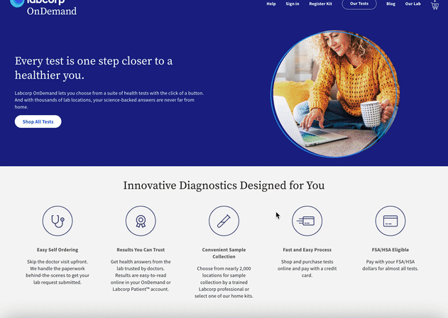
-
A website that allows patients to order at-home test kits.
-
Ran usability testing to evaluate user ability to navigate to desired products on the website.
- Based on the result, ideated features that could improve the user experience.
What I learned?
-
UX in a professional setting. This was truly a transformative experience for me. I felt honored to work with so many talented people and had the chance to practice UX in a professional setting. Throughout the experience, I learned the function of the UX team in a large company and the importance of standards, discipline, and coherence. I learned strategies to communicate with different stakeholders and ways to present the findings to other teams effectively. I also built my own system UX research methods and realised I should never let my perspective direct the research.
-
Design is never done. UX design is an iterative process and it's non-definitive. I can spend forever making a perfect research or a prototype. I should know when to stop and push the product forward. It is important to remember UX is not only about individual’s experience but about the whole interactions among all users (and experience created by it). Sometimes I need to balance between a perfect design and other difficulties (both technical and financial).